
Brand system
Style guide
How ora-ora looks and behaves: the logo lockup, two typefaces, ten colors, an 8px rhythm, and a 12-column grid. Copy here is placeholder until the brand team signs off.
01
Logo
The full logomark is the cat with the wordmark. The wordmark alone is the compact fallback. The cat never appears without the wordmark on first use.
 ora-ora
Cat height sets the unit. Wordmark cap height is 0.72 units, gap between cat and wordmark is 0.2 units. Both sit on the same baseline.
Keep one cat height of empty space on every side. Nothing else enters that zone, including rules and photography.
 ora-ora
 ora-ora
24px cat on screen. Below that, use the wordmark alone.
- Recolor the cat or the heart. They stay black and red.
- Stretch, rotate, outline, or add a drop shadow to either part.
- Set the wordmark in any face other than DM Serif Display.
02
Type
DM Serif Display for anything that should feel like a headline in a magazine. Montserrat for everything you actually read.
Display · DM Serif Display
Aa
ABCDEFGHIJKLMNOPQRSTUVWXYZ
abcdefghijklmnopqrstuvwxyz 0123456789
Italic for asides and object names.
Body · Montserrat
Aa
ABCDEFGHIJKLMNOPQRSTUVWXYZ
abcdefghijklmnopqrstuvwxyz 0123456789
Medium weight only for eyebrows and buttons.
Look at this.
Beautiful things with no obligation to be sensible.
A little museum. A little treasure hunt.
Part cabinet of curiosities. Part artist’s apartment.
Lorem ipsum dolor sit amet, consectetur adipiscing elit. Sed do eiusmod tempor incididunt ut labore et dolore magna aliqua.
Lorem ipsum dolor sit amet, consectetur adipiscing elit. Sed do eiusmod tempor incididunt ut labore et dolore magna aliqua. Ut enim ad minim veniam, quis nostrud exercitation ullamco laboris nisi ut aliquip ex ea commodo consequat.
Lorem ipsum dolor sit amet, consectetur adipiscing elit. Sed do eiusmod tempor incididunt ut labore et dolore magna aliqua.
Objects for living, giving, or looking at
Body specimen · lorem ipsum
Lorem ipsum dolor sit amet
Lorem ipsum dolor sit amet, consectetur adipiscing elit. Sed do eiusmod tempor incididunt ut labore et dolore magna aliqua. Ut enim ad minim veniam, quis nostrud exercitation ullamco laboris nisi ut aliquip ex ea commodo consequat.
Duis aute irure dolor in reprehenderit in voluptate velit esse cillum dolore eu fugiat nulla pariatur. Excepteur sint occaecat cupidatat non proident, sunt in culpa qui officia deserunt mollit anim id est laborum.
Curabitur pretium tincidunt lacus. Nulla gravida orci a odio. Nullam varius, turpis et commodo pharetra, est eros bibendum elit, nec luctus magna felis sollicitudin mauris. Integer in mauris eu nibh euismod gravida.
03
Color
Ten colors. Cream is the document canvas. Editorial pages paint each section a different field; this guide stays on cream. Cream, ink, wine, blush, and sky carry type and controls. The rest also appear as section grounds.
Wine
#5D102C
--wine / --accent
Labels, eyebrows, emphasis, hairline marks.
Blush
#D098A8
--blush / --card
Tinted surfaces, image plates, secondary fills.
Sky
#AAC4D6
--sky / --line
Rules, dividers, idle borders.
Cream
#F7F0D4
--cream / --background
Page canvas.
Umber
#3F1C14
--umber / --muted
Secondary copy and idle navigation.
Ink
#251814
--ink / --foreground
Primary type and filled controls.
Olive
#5C5B2B
--olive
Section field; cream type. Stills.
Tangerine
#DC7839
--tangerine / --highlight
Button hover, grid overlay, section field.
Chartreuse
#C0C26C
--chartreuse
Section field; ink type. Stills.
Lilac
#BAADC8
--lilac
Section field; wine type. Stills.
05
Spacing
Everything sits on an 8px baseline. Sections breathe at 128 to 160px. Inside a section, 32 to 64px.
Tight
8 to 16px
Label to value, caption to image.
Inside
32 to 64px
Between elements within a section.
Section
128 to 160px
Between sections. Never less.
06
Grid
Twelve columns, fluid gutters, fluid margins, no max-width. Four columns under 768px. Toggle the overlay to see it.
12 on desktop, 4 on small screens. Elements always start and end on a column edge. Loose layouts come from which columns you pick, not from nudging.
clamp(12px, 1.5vw, 24px). Use the same value for gaps between images in a row.
clamp(20px, 4vw, 64px) on each side. Full-bleed photography ignores it. Type never does.
- 3 / 9 for a label beside content (this page).
- 5 / 7 or 7 / 5 for photo beside text.
- 2 / 8 / 2 for centered reading with air.
Tangerine columns at 15 percent. Press G to hide.
07
Images
Product renders come from Higgsfield. These two are the reference. Every new render should sit next to them without looking like a different shop.
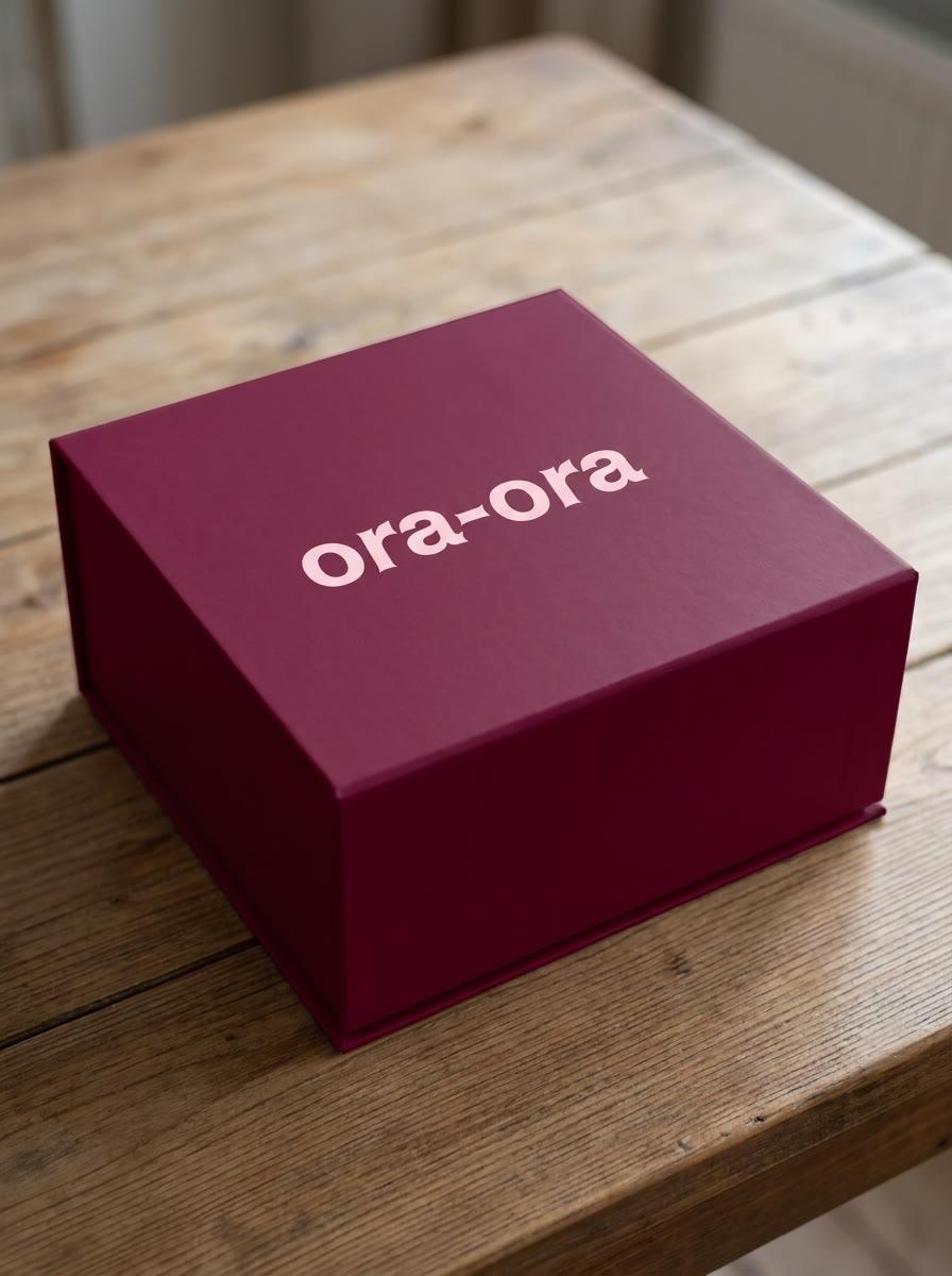
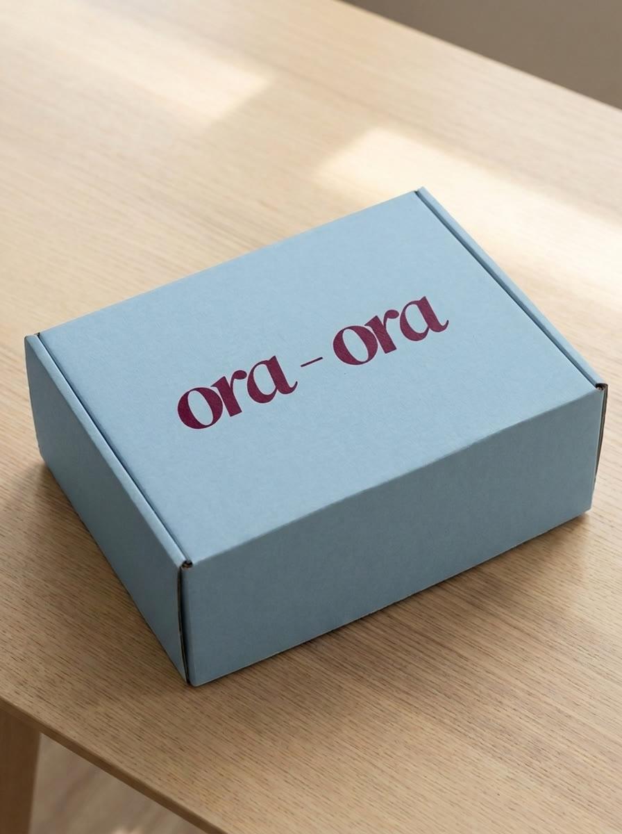
- One object, one surface, one light source.
- Natural window light, late afternoon, soft shadow to the lower right.
- Packaging color pulled from the palette: wine or sky for the box, blush or cream for the print.
- Wordmark set in DM Serif Display, printed flat, no emboss or foil.
- Camera at 30 to 45 degrees, 50mm equivalent, shallow but honest depth of field.
- Surface is oiled oak, plaster, or linen. Nothing glossy.
- Studio white sweep, gradient backdrops, or floating objects.
- Props: no ribbon, confetti, flowers, hands, or coffee.
- Extra text, badges, price tags, or watermarks inside the frame.
- Neon, chrome, glass morphism, or anything that reads as tech.
- More than one hero object per frame.
Editorial product photograph of a [box type] gift box in [wine #5D102C | sky #AAC4D6],
printed with the word "ora-ora" in a serif typeface in [blush #D098A8 | wine #5D102C],
resting on [oiled oak | pale ash | plaster] in a quiet apartment,
late afternoon window light from the left, soft shadow,
shot at 45 degrees on a 50mm lens, shallow depth of field, 3:4 portrait.
No props, no hands, no extra text, no watermark.
3:4 portrait for product. 16:9 only for full-bleed hero crops cut from a 3:4 master. Deliver at 1800px on the short side.